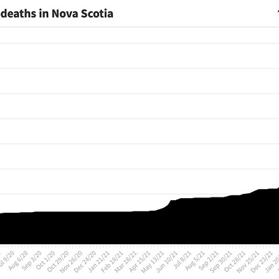
The pandemic officially arrived in Nova Scotia on Sunday, March 15, 2020, when chief medical officer of health Robert Strang announced the first cases of COVID-19 had been diagnosed in the province. And it reached a new milestone Wednesday, May 19, 2021, when Strang announced the latest batch of infections; adding that day's total (83 new cases) to all the other cases the province has announced over the past 14 months, Nova Scotia reached a grand total of exactly 5,000 cases diagnosed. Here are five interactive charts that explain important things to know about the disease at this point.
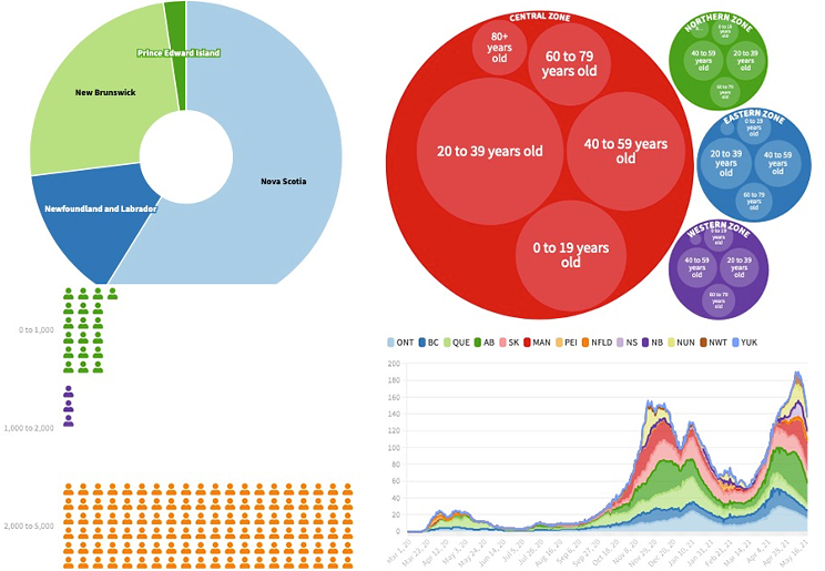
1. Nova Scotia's had more cases that the rest of the Atlantic bubble combined
In many ways Nova Scotia is the leader of the Atlantic Canadian provinces, but having the most COVID cases is a title we'd happily relinquish.
2. Each thousand cases happens at its own pace
During the current third wave outbreak, Nova Scotia went from having 2,000 cases on April 25 to having 5,000 on May 19, a firehose of 3,000 infections in 25 days that overwhelmed the testing system. But before that, Nova Scotia's second thousand—from 1,000 to 2,000 cases—took almost a year to arrive, during the prolonged May 2020 to April 2021 pandemic miracle moment we'd all like to have back.
3. Women aged 20 to 39 who live in the Central zone get COVID the most
While not a single woman aged 80 or more has been infected in the Western zone. The oldest group of men in the Eastern zone has also gone unscathed. Please click around the chart—it's interactive!—to zoom into the zones and age groups to reach the information about infections by gender. (Currently, the information accessible from Public Health only lists gender options of male and female, meaning info about the impact on people who do not align with the sex they were assigned at birth is not available.)
4. Halifax, Dartmouth, Bedford/Sackville and the Sydney area have been driving the third wave
This chart may be intimidating, but go ahead and play around with it—you won't break anything. It shows the number of active cases every day in each of the province's 14 community health networks (information that's only been reported since late January of this year). Click where it says "Tap here to select communities to compare" and you can isolate and zoom into the community health networks of your choosing; the side-by-side comparison of E. Shore, Truro area and The Valley is a good example of similar-but-different pandemic histories. Some network names have been radically shortened on the chart to fit the constraints of the graphing software. From west to east the full community health network names are: Yarmouth/Shelburne/Digby; South Shore; Annapolis Valley; West Hants; Halifax; Dartmouth; Bedford/Sackville; Eastern Shore; Truro/Colchester; Amherst/Cumberland; Pictou County; Antigonish/Guysborough; Inverness/Victoria/Richmond; Sydney/Glace Bay. (The Coast has adapted some of these from the monstrously unwieldy names the province has given its community health networks.)
5. But as awful as things feel in Nova Scotia, we aren't doing badly compared to some provinces
Another intimidating—but oddly beautiful—data visualization. This shows the number of new cases PER CAPITA every day in every province and territory across Canada, from the earliest days of the pandemic until Nova Scotia reached 5,000 cases. The per capita part is important to be able to compare each province and territory equally; technically each data point is the number of COVID-19 cases per 100,000 population. And the number of cases is technically the rolling 14-day average of new cases, in order to smooth out any one day's anomalies. But that all means we are comparing apples to apples, so if you click on the graph to isolate Ontario and Nova Scotia, for example, you can find out which province is getting more cases in terms of its population, and Ontario's huge size doesn't make any comparisons useless.