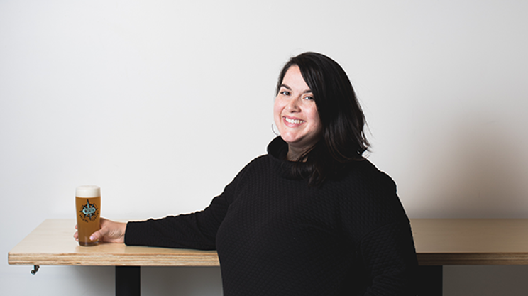
Amy Corbett's been drinking North Brewing's beer since it was called Bridge Brewing. A graphic designer, web developer, art educator and abstract painter with 20 years of creating under her belt, she'd hustle to the Alderney Landing farmers' market to grab her swing-top bottles every Saturday. Her official collaboration with the brand started later when—in an effort to use local art on their labels—her neighbours, North's Peter Burbridge and Rozina Darvesh, used her paintings on labels for their Midnight barrel-aged Belgian, and the one-off Dark Sky dark Belgian. Now, her mixed-media style is becoming synonymous with a can of North beer.
"We try to follow the methodology that weird is wonderful," says the artist. "We usually start with a small brief which just includes the type of brew, the flavour profile, the ingredients and the name. I think it adds another creative element to it—you kind of have to translate those flavours visually."
Corbett's love of abstraction, texture and juxtaposition lead her to dig out a collection of old magazines while working on her first original design for the Soleil Saison, a look that's set the tone and colour palette for the brewery's latest labels. We asked about the brainstorms that brewed up these three designs.

1. Soleil Saison
"I knew that was a refreshing beer, a table beer. The design I wanted to evoke that feeling—how would that taste look? That's how I started. It had to be light and airy and I just thought, 'What's the best feeling? Sunshine on your face,'" says Corbett, who turned to vintage magazines she found at an antique shop in Hubbards years ago for inspiration. "I like to try and work with different moving parts. I like a lot of texture, I like the juxtaposition of something static versus something digital versus something tangible."
2. Into the Aether
The North team had
3. Bloom A co-pro