Although the newly unveiled city logo hasn’t inspired unanimous acclaim from citizens, nobody can fault the Halifax re-branding effort with being predictable. Even if the new design isn’t remarkably bold, this redesign does depart boldly from its predecessor.
Behind the transformation is Phil Otto, CEO and strategist for Bedford-based branding company Revolve. After the initial wave of (completely expected) negative feedback, he hopes the city will grow into the clean, modern look.
But as first reactions roll in, public sentiment seems more underwhelmed than negative. Perhaps the accompanying motto “Be bold” is responsible.
“I can understand the public's confusion,” says Katelyn Bourgoin, a brand strategist at Red Riot marketing firm. “I think it's important to realize that being bold doesn't necessarily mean being loud or brash.”
Other brand design experts share a similar view. Although the logo is sparse, Form:Media managing director John deWolf says people should look at how the mark is used in concert with other elements like colour, photos and environment. “It’s unfair to judge a mark on its own,” he says. “The mark itself doesn’t have to carry the entire statement.”
Simplicity was also a solution to avoid dividing the city. Because the name was shortened from Halifax Regional Municipality—whose logo included a wave and a lighthouse as the “i” in Halifax—Otto did not want to include any visual icons that would further limit the geographic scope. “Any icons would have focused on the peninsula,” he says, “which would have been even more polarizing.”
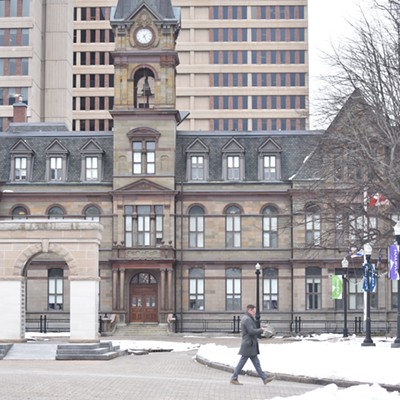
Michael LeBlanc, chair of design at NSCAD, agrees with the decision to scrap the lighthouse featured on the old logo—especially in light of the city’s efforts to attract attention from abroad. “Icons are only important to people within a community,” he says, “but if it’s somebody from Germany or China, they might not know what that thing is. If our intention is to go global, it makes sense to go with letter forms. Not lighthouses or clock towers.”
Bourgoin seconds that opinion. “Halifax is much more than our landmarks,” she says. “And we need to start embracing that.”
Another point of contention has been the more than $200,000 price tag. Following the unveiling of the logo and its expense, some asked why the city didn’t host a contest among local design schools. LeBlanc says using students to cut costs is not only unprofessional, but would take work away from graduates.
“The perception of the public is that creating visual products is easy,” he says. “There are a lot of people who think that someone with a little bit of training and a little bit of software can do the job. That’s not correct. It’s exploitative and it belittles the craft. Would you do the same for accounting? Just because someone can add, that doesn’t mean they should be your accountant.”
Otto defends the cost of the project—only five percent was actually spent on creating the logo. The majority went to financing background research: Revolve collected feedback from 20,000 people in different areas of the municipality through activities like focus groups and community events. He also points out that in addition to the logo itself, usage guidelines were developed to dictate how the logo appears on everything from parking tickets to the side of buses.
“The part a lot of people are forgetting,” says Otto, “is that the city currently supports dozens of logos. ... Those will be consolidated under this umbrella brand.”


