It turns out the theory that small spaces need to be light or white is bunk.
Hue Design Studio’s
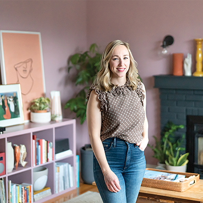
Michele Muir—an advocate for warm walls— says condos and smaller rentals are ripe for paint risk-taking. “A lot of these new spaces, I find, have higher ceilings so what you’re losing with square footage you’re gaining in height,” she says. “There’s good natural light, flooring is generally neutral and you can really bring drama to that by adding something deeper to the walls.” Here are three bold and beautiful colours this expert suggests you play with.
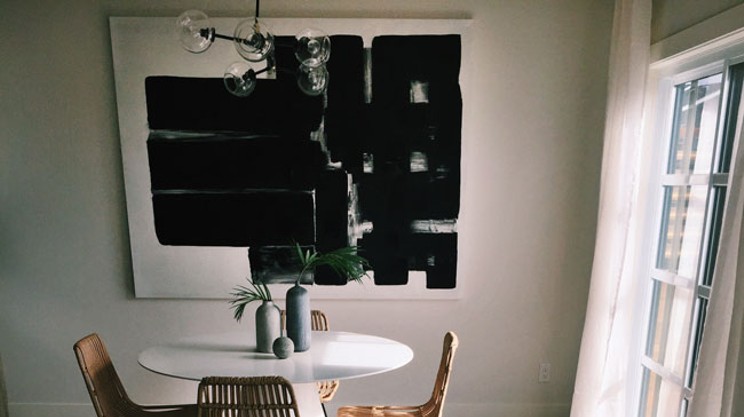
Hague Blue
“It’s this deep, deep navy, with a bit of a marine green under it. It will play in the light depending on the lighting,” says Muir of this Farrow & Ball tone, which looks stellar with chrome and gold accents, like picture frames. “Dark colour doesn’t always mean you’ll feel dark, it brings
coziness too.”
Studio Green
The key to pulling off these dark, warm colours, says Muir, is neutral furniture, light wood and white cabinetry and baseboards. Hopping on the dark green trend is the Farrow & Ball’s studio green. “It’s like having black without it being black,” she says. Also perfect for an accent or gallery wall.
Pelt
“I’ve always been a fan of colour, especially deeper jewel tones,” says Muir of this eggplant-
esque purple from Farrow & Ball, which works well with grey and white accessories. “I crave warmth on my walls.” She suggests folks not ready to take the leap to dark walls can try painting
furniture or interior doors for “oomph without commitment.”