Halifax's logo is staying on some of your community signs, Dartmouth, but at least it’ll be smaller and harder to read.
An information item headed to council next week says the chief administrative office and HRM’s corporate communications are developing new applications for the municipality’s pervasive branding that will “better reflect brand values and pride of individual community identity.”
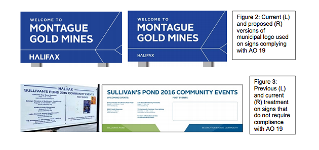
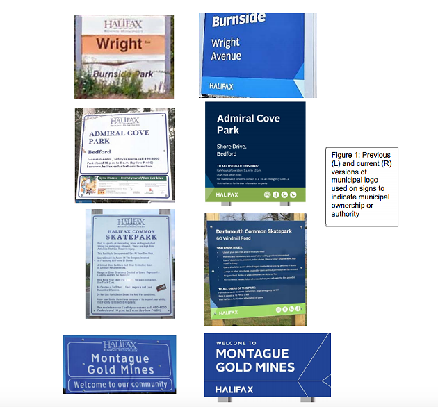
That will be achieved, in part, by making the new HΛLIFΛX logo tinier and less noticeable on some signs, and removing it altogether from community noticeboards (see below).
Prepared by Bruce DeBaie, managing director of corporate communications, the information report comes out of council unanimously voting back in February to examine how the municipality had applied its fancy new logo. That motion was itself a watered-down version of councillor Gloria McCluskey's request to look at covering up and removing the brand from community signage in areas outside the old Halifax city limits.
“We are hurting, your worship, in Dartmouth,” said McCluskey at the time to mayor Mike Savage. “We just want our identity back.”
It's been over two years since HRM voted to incorporate the new and blue design from Revolve Branding in the municipality’s corporate coat of arms, logo and flag.
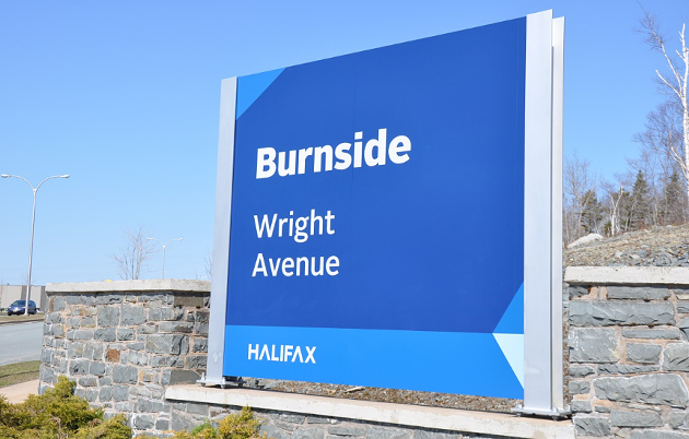
Almost immediately upon its debut, Dartmouth residents expressed dismay with the design for seemingly erasing the history of Halifax's sister city. That outcry increased with the appearance of the new logo on Dartmouth community signs in Burnside and Sullivans Pond, as well as the flags near Alderney Landing.
The new logo was never intended to “dilute or undermine the identity and value of local communities anywhere in the region,” writes DeBaie. “On the contrary, the new brand intends to promote the strengths and celebrate the characteristics of each community by putting our collective assets, values and personality forward and showing the world what a great place our region is to live, work, visit and invest.”
The community signs, DeBaie adds, previously had a larger HRM logo in a more prominent top-centre location. The new logo is smaller and placed as a footer on the bottom of the signs, but ironically it stands out more because of the simplified design. “It strategically reflects the brand promise to ‘be bold.’”
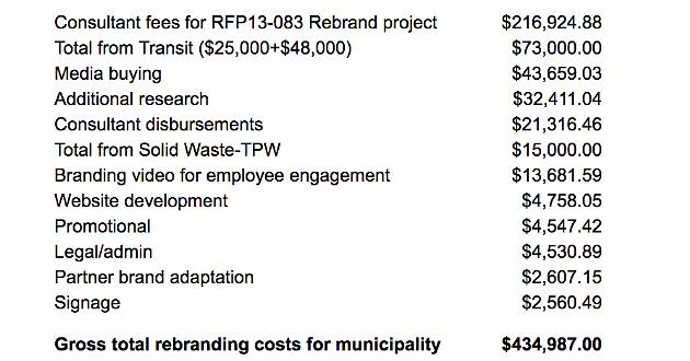
The staff report also breaks down the total costs to date for implementing the new signage, which comes out to $434,987 in development, launch and brand promotion (see the breakdown below).
Those costs are outside of standard budgeted amounts. Buses and ferries, for example, were only branded with the new logo during scheduled maintenance work when they would have been re-painted with the old colours anyway. That said, the new colour scheme did cost $600 more per bus for some reason, which works out to an incremental cost of $48,000 for bus repainting and an extra $25,000 to “create the specific visual identity of [Halifax Transit’s] assets.”
DeBaie notes that the “consistent, predictable brand management system” for the new logo did lead to “significant” efficiencies in HRM’s corporate communications budget, and created a savings of $225,000.


