"Do I ever buy beer based on the label? Oh yeah I do," says Ron Bishop, beer merchant at Premier Wine and Spirits. Shelf after shelf, we are given overwhelming choices. Want a simple stout? There are 15 that range from a mass-produced import to a secret recipe from the nearby craft brewery. When it comes to beer branding and design, consumers most often buy into the rhetoric of the image.
For decades, large-scale beer producers have spent billions on branding products for wide appeal. In the last few years in the Atlantic region, craft breweries have taken back the principles of production to cater to a smaller but more adventurous beer-drinking public. Product designs are studies in semiotics.
And sales revolve around buyer preferences. The Nova Scotia Liquor Corporation is the primary distributor in the province. Operating by revenue, do aesthetics play a role in what the NSLC stocks?
"Short answer: no," says Mike Maloney, external communications rep at the NSLC. "The brand isn't necessarily what's on the label. Take Budweiser–the brand means something more than the design. It's emotive rather than visible." He says Budweiser relies more on brand personality (beach parties, machismo and busty ladies) than creative design. The simple logo denotes the brand's overall character.
But the NSLC reports a 25.5 percent growth in craft beer sales in Nova Scotia in the last quarter, and there is a distinction in how craft beers and small brewers present themselves in a crowded market.
"In ciders, for example, you see two design styles even though the products have the same taste profile. There's rustic, or new and polished," says Maloney. But rustic branding, in contrast to the stark silhouettes of Budweiser or Pabst Blue Ribbon, similarly relates to the brand's small-craft personality.
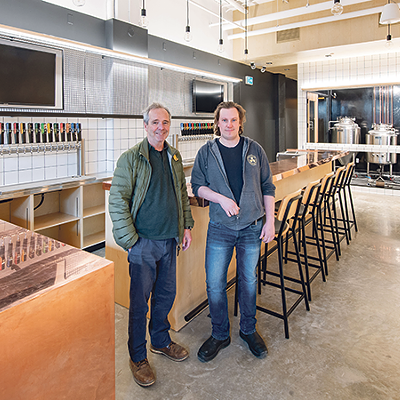
"Craft beer customers are concerned with the quality of the product and where the product comes from," says Peter Burbridge, owner of North Brewing Co. (formerly Bridge Brewing), established last year. "The branding therefore needs to reflect these aspects of the business."
To portray these ethics, Burbridge commissioned former Halifax artist Chris Foster to create a clean-lined, handmade design. "I wanted something that evoked the ideas of hand-crafted, small scale and locally made products," he says, adding that the company receives a lot of compliments on its branding. "People are increasingly choosing to buy local and support small independent businesses." So the labels follow suit.
A number of local breweries have channeled the rustic template: New Brunswick's Picaroons features lumberjack, old-timey figures; Halifax's Garrison draws local and historic military icons and Rare Bird, from Guysborough, features a smiling seafarer. Much of craft beer design locates a regional aspect and an appeal to nostalgic tradition. Brands like Propeller Brewing Co. and Boxing Rock Brewing Co. slightly modify a central, staple design so that the product line is visibly consistent, like local mega-brands Keith's and Oland's.
"The question of brand loyalty gets at the root of the difference between the craft beer market and the traditional beer market," says Burbridge. "For the most part, craft beer drinkers are not loyal and we don't want them to be." Design variety invites purchase variety.
"You can read the bios or the beer descriptions, but more often I see people making decisions based on the appeal of the label," says Bishop back at Premier. He points to Montreal's Dieu de Ciel's gothic fantasy theme. "At first I thought they were ugly drawings but they're growing on me." While there are still clear gender biases in beer marketing (lumberjacks? Come on), it all comes down to taste.