What are the most important things people should consider while selecting a paint colour?
I always advise clients to not rely too much on what the trends are. Colour is a very personal choice and is affected by many things such as lighting, flooring tones, trim colours, furniture style and colour. The most important thing for people to consider is paying attention to what colours they respond to. They should live with a colour palette they love and that reflects their personality. Always remember: It's just paint. It is the cheapest and easiest thing to change but has an instant impact.
Are there specific colours or combinations people should avoid for certain rooms of their home?
This gets tricky. Because we all respond to colour in a different way, the colours we need to avoid are dependent on what we respond to. All the colours represent a different emotion and people with those personality traits will be drawn to the colour that represents it. For example: blue gives you the focus to visualize. It is the colour of dreamers and visionaries. It appeals more to those with mental discipline and the ability to envision a more beautiful life, whereas yellow gives you the wisdom to know what you need. It aids in gaining the power to know what motivates you and see the reality of others.
I always tell people to pay attention to what their eye is drawn to when they are out shopping at a home decor store or even a clothing store. It isn't about what you think your favourite colour is, it is about what your eye automatically goes to.
A lot of people want to liven up their space without a major overhaul. What are some ways to do this using paint?
If you love a trendy bold colour but don't want to commit a whole room to it, do a feature wall somewhere. Colourful wallpaper will achieve this as well. The trick is to not use the bold colours in large quantity, but just as complements to the decor or in an area you don't spend a lot of time in. Somewhere you tend to just pass through, like your entry, hall or powder room. You can create huge wow factor just painting your hallway in a deep hue then have the adjoining rooms light and bright. It can be stunning when done right.
While we're on the trend topic, do you have a favourite right now?
I am currently crushing on the continuing trend of bold colours like navy, teal, orange and even the rose-gold colour that was seen all over IDS in Toronto. I've never really been a pink girl but, am finding myself drawn to it so I don't fight it. White is taking centre stage in homes with the bold colours acting as the icing on the cake.
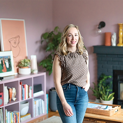
Michele Muir is a certified Dewey colour consultant and the owner of Hue Design Studio, 5585 Sullivan Street. huedesignstudio.ca